You can now do data wrangling, analysis and visualization without leaving Easy Data Transform! This has been a major piece of work and we are very exciting about all the new capabilities it adds.
You can download the beta here:
You will need a valid v2 license to run the beta.
Please try the beta and post any feedback (bugs, suggestions etc) here or email us.
This beta should be pretty robust. But it isn’t tested to production quality. So bear that in mind when you use it.
This beta release expires on 20-Mar-2026. By then there will either be another beta or a production release you can upgrade to.
When we make the production release, the current product will become Easy Data Transform v2.11 Basic edition - with all the functionality of v2.10
Easy Data Transform v2.11 Advanced edition will be released - with all the functionality of v2.10 plus the new charting/visualization features
Upgrading from Basic to Advanced edition will be optional. If you don’t want the new visualization features, you don’t have to upgrade.
Easy Data Transform Advanced edition will be available for $199+tax and you will be able to pay the $100+tax difference to upgrade from Basic to Advanced. We also plan to offer a significant, time-limited upgrade discount for existing customers. Watch this space.
Working great here. On a lark, I read the XML source for a word processing file into EDT. While it doesn’t appear to be a particularly productive thing to do, EDT had no trouble with 20,000 columns in the output.
Good to know. If Ridiculous isn’t enough, Ludicrous won’t cut it, and even Plaid is overwhelmed, there are levels beyond.
woah i am definitely inclined to upgrade - i think it is a great option having it - you can verify your data with charts - there are so many options here
Let me start by saying that charts are a really nice addition. Would i pay an additional $100 for them? Not a chance.
A couple of things that i think would make charts better:
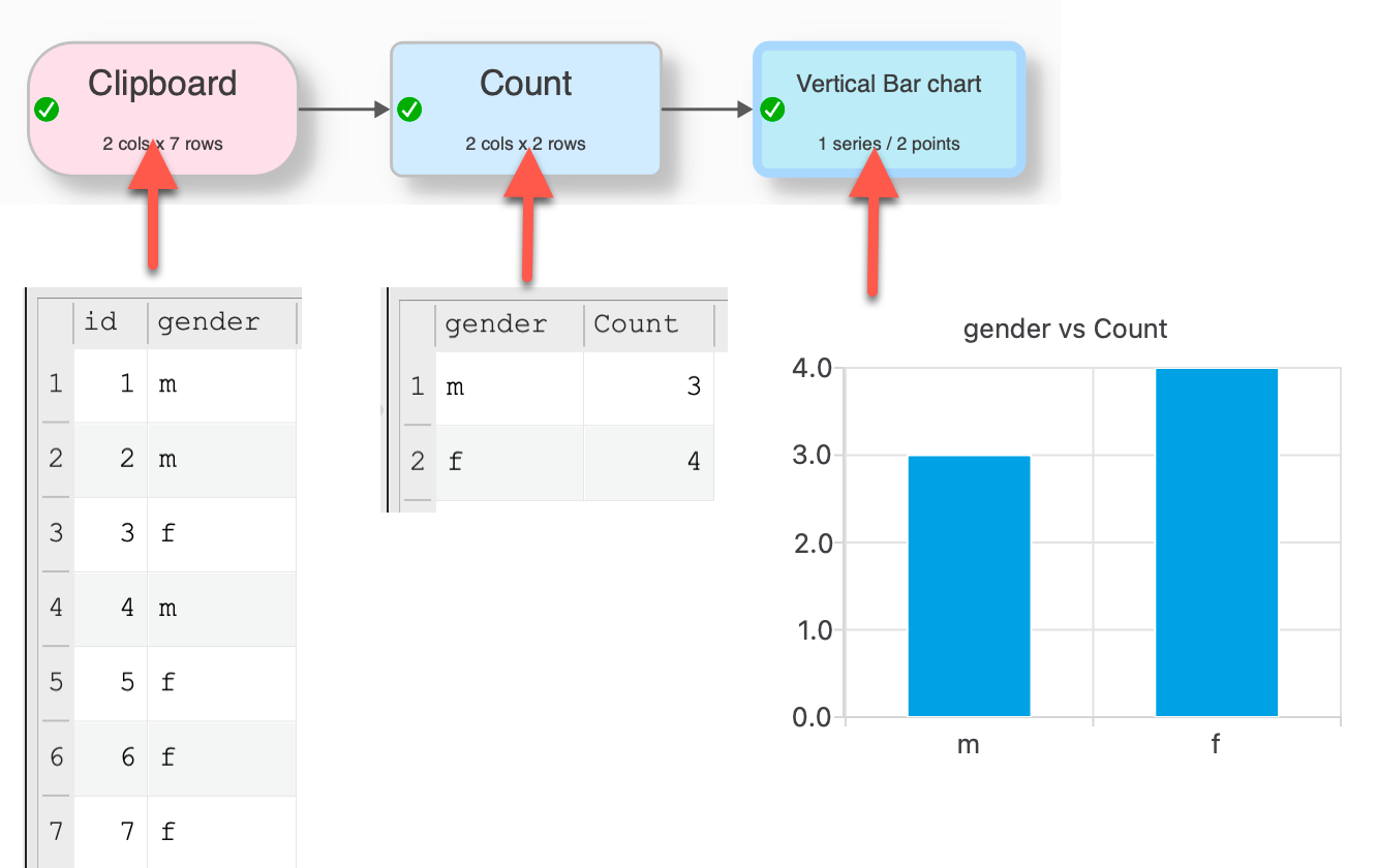
Would like to be able to carry out summary calculations within the chart element itself (e.g. ave/max/count/count distinct etc - the options would vary depending on column type) without needing to go through another transform (e.g. pivot) beforehand. For example if i want to display a count of female/male records in my dataset i want to select gender as the x-axis and person id as the y-axis and have the chart show a distinct count of person id.
I’d also want to be able to have some control over the colours used in the charts so that (where relevant) specific colours could be assigned to particular categories.
With have a number of different themes with different colors. But you can’t select your own color palette at present. It is something we might add to a future release.
Thanks for your response. Colours would be a must for me in relation to adhering to branding constraints and assigning specific colours in some use cases. A couple of other questions:
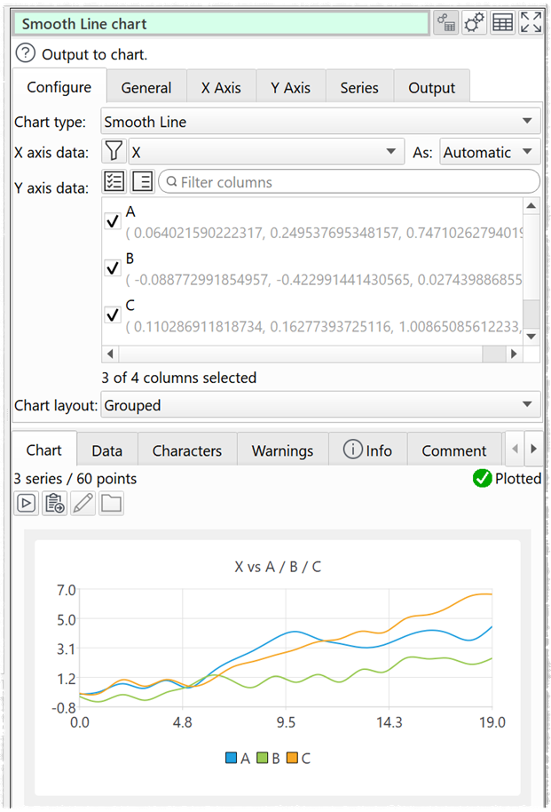
Is there a way to contol the format of the numbers on the axis? e.g. in your gender example chart above the numbers should really just be displayed as whole numbers (1,2 etc as opposed to 1.0 and 2.0). Thinking too though of a way to control the display of very big numbers.
Are tooltips an option? i.e. to view the data value when hovering the mouse over data points (realise this would only be of use in-app)
Can the charts be used with time series data? i did try to test but wasn’t successful
****
Having played with the charts a bit more I do think they are good but what you can do with them is fairly basic. I think they could be potentially of use in EDT for some data validation purposes but, as it stands, the end product isn’t anywhere near powerful or flexible enough to enable me to use the charts for my particular real-world needs.
Not in the current beta. But it is already done for the next beta.
They are on the wishlist for future releases. But not for v2.11.
Data and times on the X axis will currently be treated as text. You could use Calculate + DateTimeToMSecs or DateToJulianDay to convert them to a number. Being able to properly handle dates/datetimes is on the wishlist for future releases. But not for v2.11.
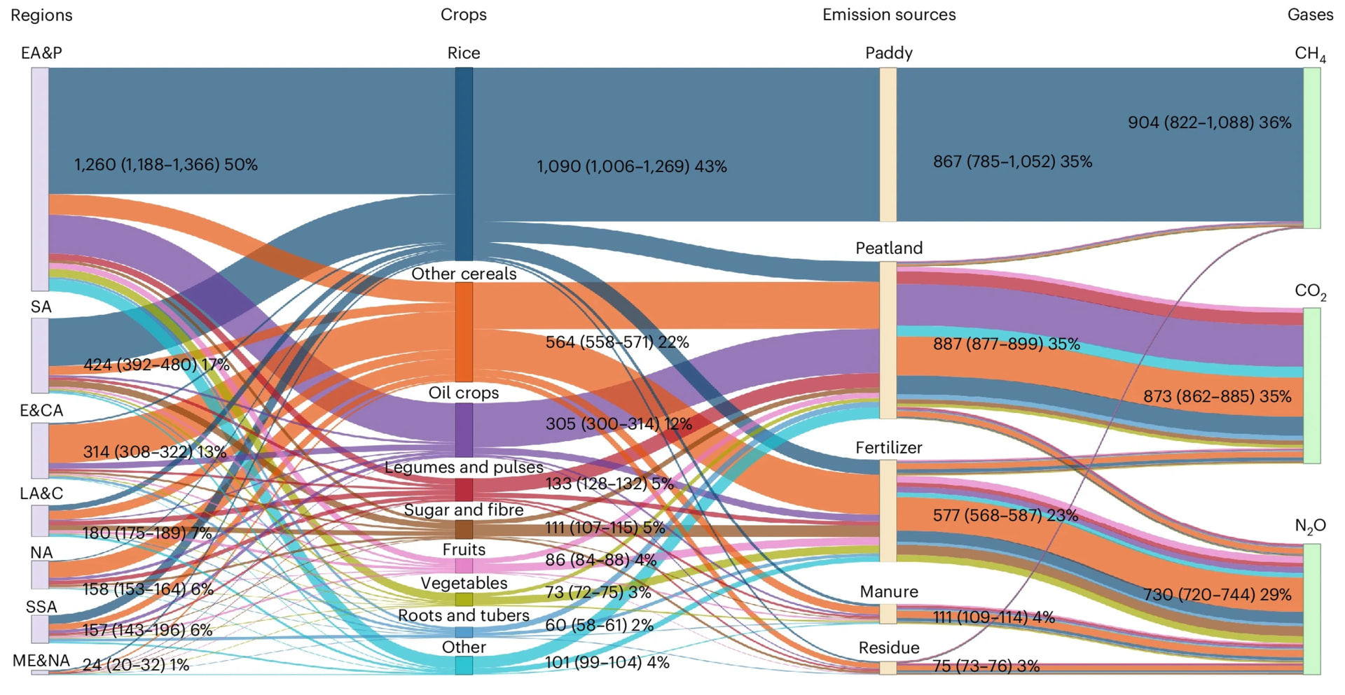
About chart type, considering the type of processing performed by EDT a Sankey chart would be VERY interesting to have - see an example below and a paper about it https://pmc.ncbi.nlm.nih.gov/articles/PMC9232856/:
Sankey diagrams represent an insightful but complex and specialized graphic method.
I think this is very specific graphic: I studied and have the master in Statistics and find it hard to get the meaning. At least you need longer to interpret the results of the figure and then it seems to give a good view. From my point of view this is a special topic which is to be set up in special programs.
From my perspective EDT is a solution for data transformation, analysis and in the future adhoc graphical representation. Special graphics and graphics for official publishing should be prepared in specific tools (at least my view). I would assume that less than 1% of user would use this specific Sankey diagrams.
There are more features on wish list waiting for implementation which would be used by a wider audience.
We may add additional chart types in future. But there are a lot of other things we want to do ahead of that, such as allowing customization of colors, fonts etc in the existing charts. Also Sankey charts look very specialized.
I agree with Olaf on this. I am evaluating whether v2.11 will be worth the extra cost. The payoff would be quick review of basic single variable distributions or two-variable relationships. I have specific, powerful, programs for stats and for charting, for which EDT prepares input. I can see an efficiency payoff from recognising need and executing some transformations in EDT rather than catching up in a different tool. Better to have a single source than the same changes separately.
The app for managing our house battery offers a Sankey diagram of inputs and outputs as a feature. It was interesting to examine the whole picture yet I have ditched that display for the two small data tables which are more succinct, with direct, explicit data. For me Sankey diagrams are more for overview presentation than for analysis.
On a side note….not convinced that Advanced edition is a good name for this. The regular EDT is advanced. It is no more advanced with the addition of charts. What about something like EDT+ / EDT Plus?