Admin
1
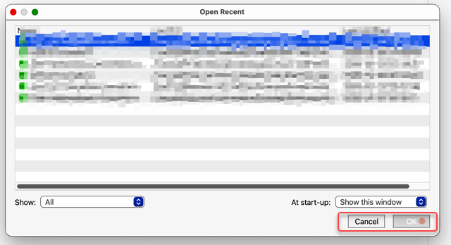
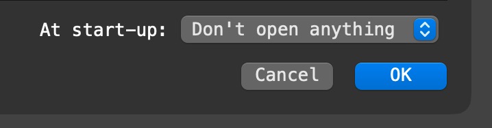
A customer on macOS 26 is reporting that they are seeing low-contrast, square buttons like this:
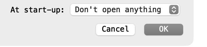
This is what we see on macOS 26:
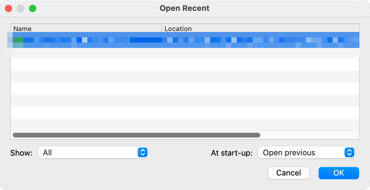
We have tried tweaking the macOS UI appearance, but we can’t reproduce the issue.
Is anyone else seeing something similar to the top image?
Yes, the low contrast is on my mac as well.
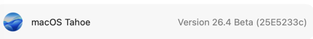
I’m running
1 Like
Admin
3
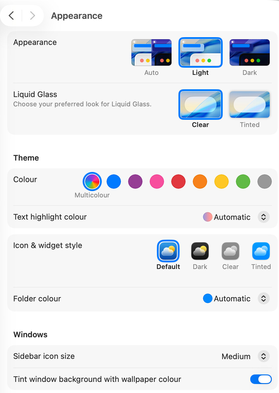
I am running macOS 26.3.1 and these are my ‘Appearance’ settings:
Olaf
4
I have the same appearance setting as @Admin (beside I use dark mode) and no issue with the buttons (Tahoe 26.3.1)
1 Like
mm1
5
Mine looks like yours, on dark mode, also on 26.3.1.
MacOS 26.3.1
Settings: Appearance auto, Liquid Glass clear, Icon&Widgets default
No contrast issues day or night.
Admin
7
@DanFeliciano Are you running some sort of windowing or skinning software on your Mac?
Have you noticed the same issue with any other applications?
Olaf
8
maybe it is just the theme color selection if I set it to grey and select the light mode it look like
which has still more contrast. But I can imagine it is the general setting of Tahoe or another tool changed something.
Admin
9
That doesn’t make the buttons square though. I think it must be something more than a macOS theme/color setting.
Olaf
10
I just see DanFeliciano (in the entry above) runs 26.4 Beta. Maybe it is an issue in the Beta release of OS
Admin
11
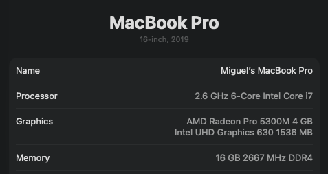
The other customer with the issue is running 26.3.1 on an M4 Macbook Pro.
Admin
13
Still haven’t got to the bottom of this one.