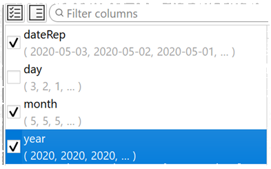
We exployed a usability/UX consultant to look at Easy Data Transform and make some suggestions that would make it easier to use. He came back with a lot of great ideas and we have implemented quite a few of them in the latest release. For example the inclusion of example data values along with column names:
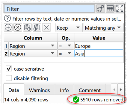
Feedback on the results of each transform:
Feedback on all transforms;
We hope these changes will improve productivity for new users and experienced users. There are also other improvements and bug fixes.
Nice update. Here is a suggestion? Can the transforms listed on the right side of the screen be reorganized to include an icon or have the option to include an icon that visually depicts the transform. A picture or icon is worth a thousand words.
I’m not sure it is possible to come up with 52 different meaningful icons (or colors). But I have thought about icons for the separate transform categories:
Merge transforms
Column transforms
Row transforms
Format transforms
Analysis transforms
Other transforms
Plus also the operating system icons for the file types (e.g. the Excel icon for .xlsx input/output).
I like all the changes, very helpful. The only change I would suggest is with the example data along with the column names. The idea is great but could the column name be left justified with the example data continuing after it to the right? With several columns in the list, the example data clutters up the ability to quickly identify a column.
Great work!
Dave
Yes, I was thinking of one line but understand, it was just a thought. I really like the changes. Especially the offset transform. It is very useful and I will use it for multiple purposes.
Thanks,
Dave