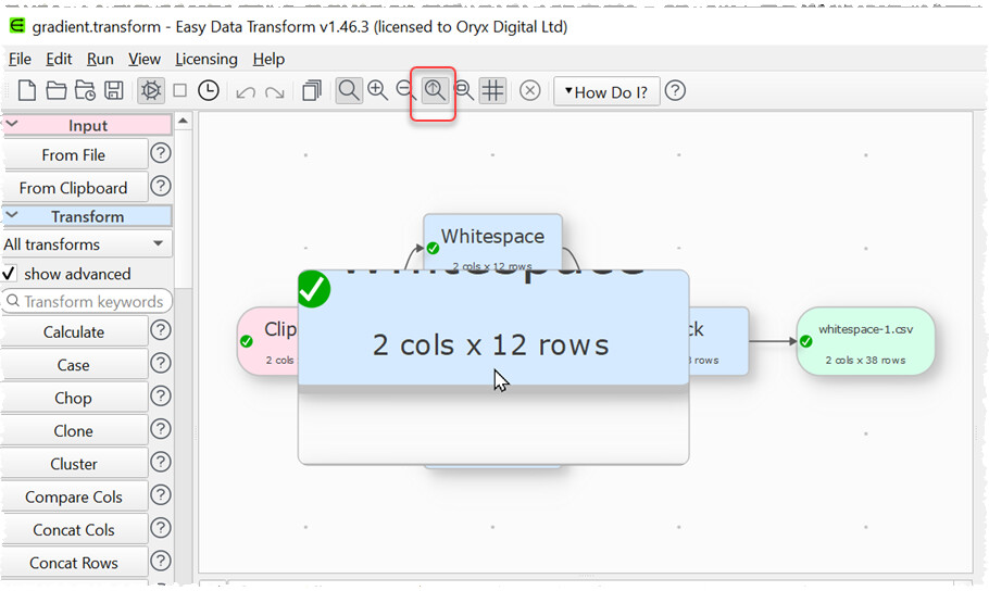
Playing around with a simple gradient effect. What do you think?
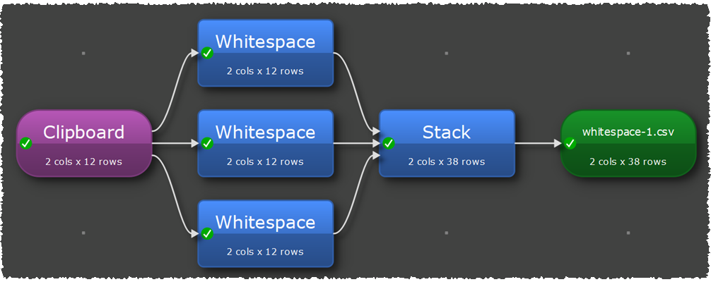
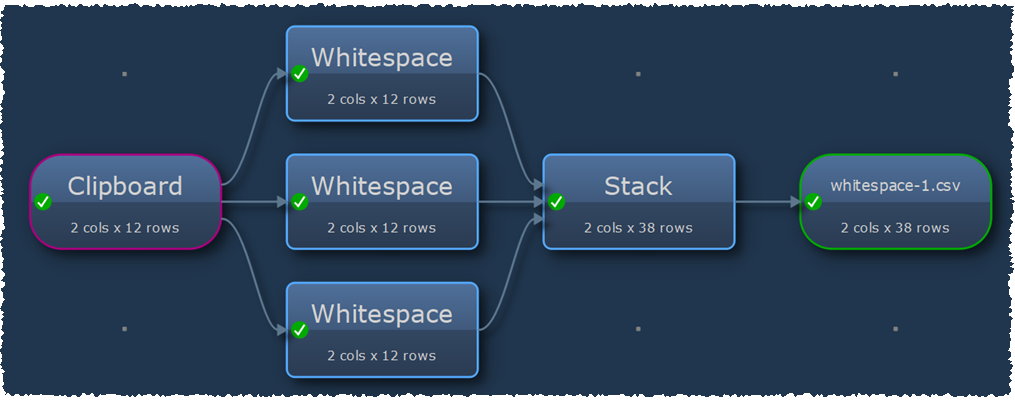
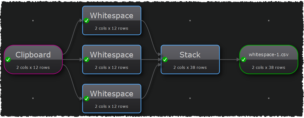
This is for aesthetics only. It makes no functional difference. The effect is optional, it won’t change any of the existing color schemes.
Playing around with a simple gradient effect. What do you think?
This is for aesthetics only. It makes no functional difference. The effect is optional, it won’t change any of the existing color schemes.
looks nice … but, during creation and processing I check the information on cols and rows a lot. My feeling from the screenshots is, that these part a less readable compared with current presentation, maybe the font needs to be enlarged of made more bold for presentation of the counts.
They are optional. We might look at rejigging the text and fonts on the center pane items in v2.
sure, using it a lot. I think you even build it and the search functionality based on my request for some further documentation options ![]()
I had just the feeling, based on your screenshots, that it is a little less readable with the gardient effect. But maybe I’m wrong.