On day 2 of my trial with EDT and have to say i’m impressed. I managed to extract particular components from a JSON file that i had been struggling to do with other methods.
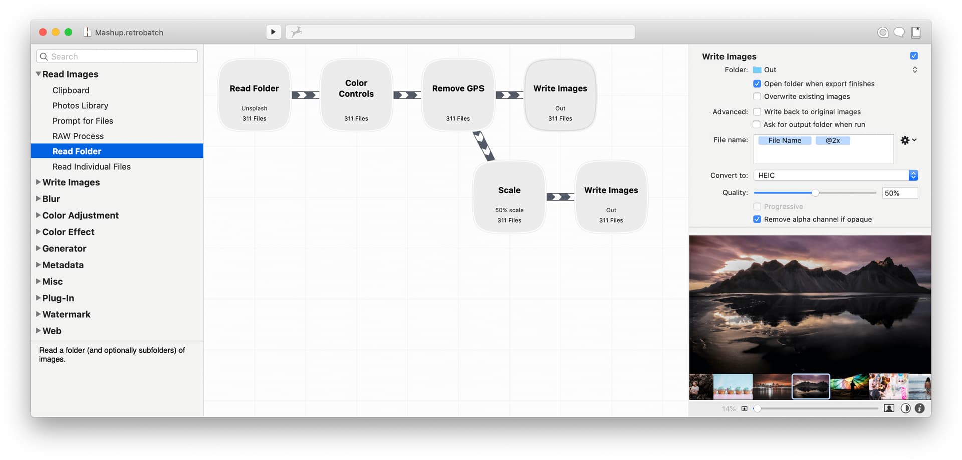
I am a bit put off by the look of the application though. I know functionality is the key aspect but i would like things more if it looked a bit nicer / more modern. I don’t know if you are familiar with Retrobatch - which is an application that does with images what EDT does with data. The interface there is super slick:
Additionally, as merely a hobbyist in terms of my data needs, the cost of the application is quite high. I am happy to pay it (especially now during Summerfest) but have seen mention of a v2 on this forum. Is there any indication of when this might appear and if it would be a charged for upgrade?
And finally want to add a +1 to being able to access online files directly (e.g. csv on a web server) and for tapping into APIs. I know these are on the roadmap already.
Aesthetics are subjective. Personally I think Easy Data Transform looks nicer than Retrobatch, based on the screenshot you provided. Especially the flow pane. But I am biased, obviously. Note that you can change the Easy Data Transform center pane color scheme in Preferences.
Also Easy Data Transform is written using the Qt library, which means there are few compromises in how native it looks on macOS. But it also means that we can build for Mac and Windows from a single source (a license covers both).
If we price too low we wouldn’t be able to afford to provide decent support. Also we are crazily cheap compared to some of our competitors. Some of our more enterprise-focussed competitors are thousands of dollars per user per year.
If it is released within 3 months of you purchasing v1, you get a free upgrade. Otherwise it is a 60% discount compared to a new license. Upgrading is optional, you can just carry on using v1 forever if you prefer.
We never promise release dates, as a matter of policy. It’s ready, when it’s ready.
Yes - i can get the flow pane to look good with custom stylings. Short notes don’t look good in it though as the text size is crazy big. Also - would prefer if the border radius was the same for input and output nodes as it was for the process ones.
I think it is the left-pane i have most issue with but totally appreciate the limitations you mention.
I don’t doubt it. And for power users it will be a no brainer. And i too will be purchasing for sure. Keep up the good work.
If we limit the font size then you just end up with a lot of unused space in the note that makes it harder to read when you are zoomed back.
The difference in shape is intended as an additional visual cue, e.g. for people who are color blind. State transition and flow diagrams use radically different shapes (e.g. circles and diamonds) but they are less easy to write text inside.
You seem to be very defensive of the look and feel. I am simply offering what i though might be constructive feedback on some options that end users might appreciate.
Is this not when we would make use of tooltips? I wouldn’t expect to be able to read things when zoomed way back.
That’s great but i would appreciate the flexibility to override this default if possible.
Hopefully not. Just giving you some reasons for why things are the way they are.
Constructive feedback is always appreciated. But obviously we aren’t able to implement every request.
I’ll bear that in mind. However we have to be careful not to add too many options or the Preferences window becomes hard to use. Also changing the shape means screenshots in the documentation would look different to what you would see.